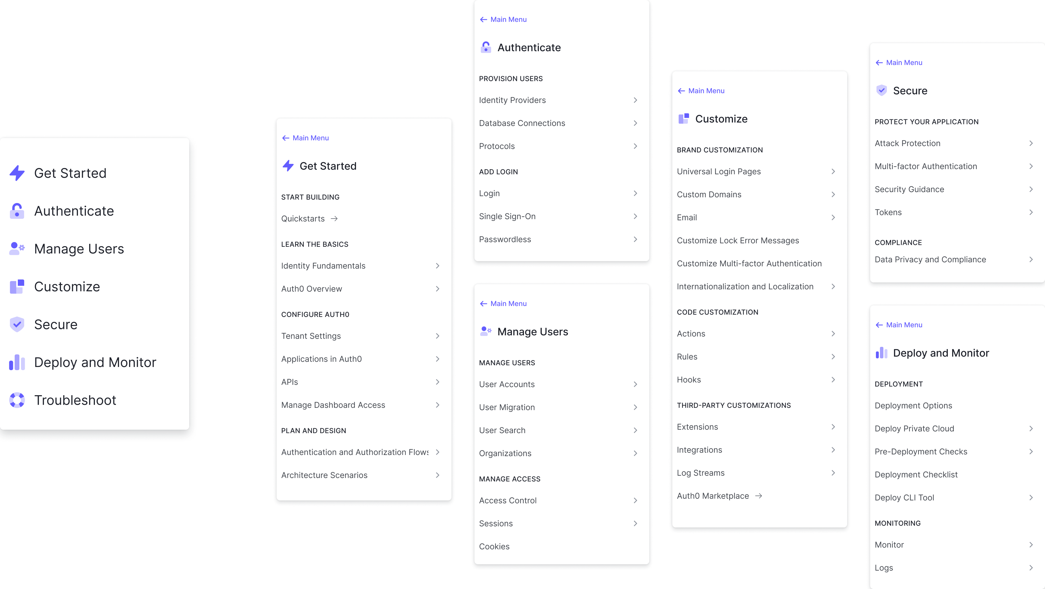
Auth0 Docs Information Architecture
Overview
A strong developer experience has always been a core part of Auth0’s DNA. Since our founding we have deliberately built a developer-first product and it continues to be a key part of our success to this day. Naturally, maintaining excellent developer documentation is an essential part of our strategy.
Auth0 Docs: Love ‘em or Hate ‘em
We had gotten a lot of feedback over the years from the developer community that our docs were fantastic and they were frequently cited as being a competitive differentiator.
Unfortunately, we also got a lot of feedback that our docs were terrible and difficult to navigate.
I'm a noob at Auth0 so @raae is probably a better source of info. However, as an Auth0 noob it took me about 3mins to get basic sign up / login flows working.
— Paul Scanlon (@PaulieScanlon) August 6, 2021
The docs are really good too + James Quick (Dev Rel) is an absolute gent!
honestly I have never tried to use a piece of technology that made me feel more stupid than auth0 (at least recently).
— Monica Lent (@monicalent) December 15, 2021
such confusing docs spread everywhere, it was so bad I was explicitly looking for unofficial docs in google. the ease of MVP setup is super misleading…
Discovery Interviews
To determine why some people loved our docs while other people hated them, I began conducting discovery interviews with our customers.
I learned that in general:
Developers who liked our docs
- Had more pre-existing Identity and Access management (IAM) knowledge
- Relied more on Google searches to find docs or community forum posts
Developers who hated our docs
- Had less Identity and Access management (IAM) knowledge
- Relied more on our sidebar navigation because they didn’t know the concepts well enough to choose good search terms
- Ended up jumping back and forth between lots of open of tabs
Making Sense of the Mess
I performed a content audit of all 1000+ pages of docs, putting together a massive spreadsheet highlighting the problems in the IA. (I am precisely the kind of nerd who finds this sort of task highly enjoyable).
The biggest issue was that our sidebar navigation was manually generated, but our breadcrumbs were automatically generated based on the file structure of our CMS. Over time the two had diverged, leading to a number of mismatches.
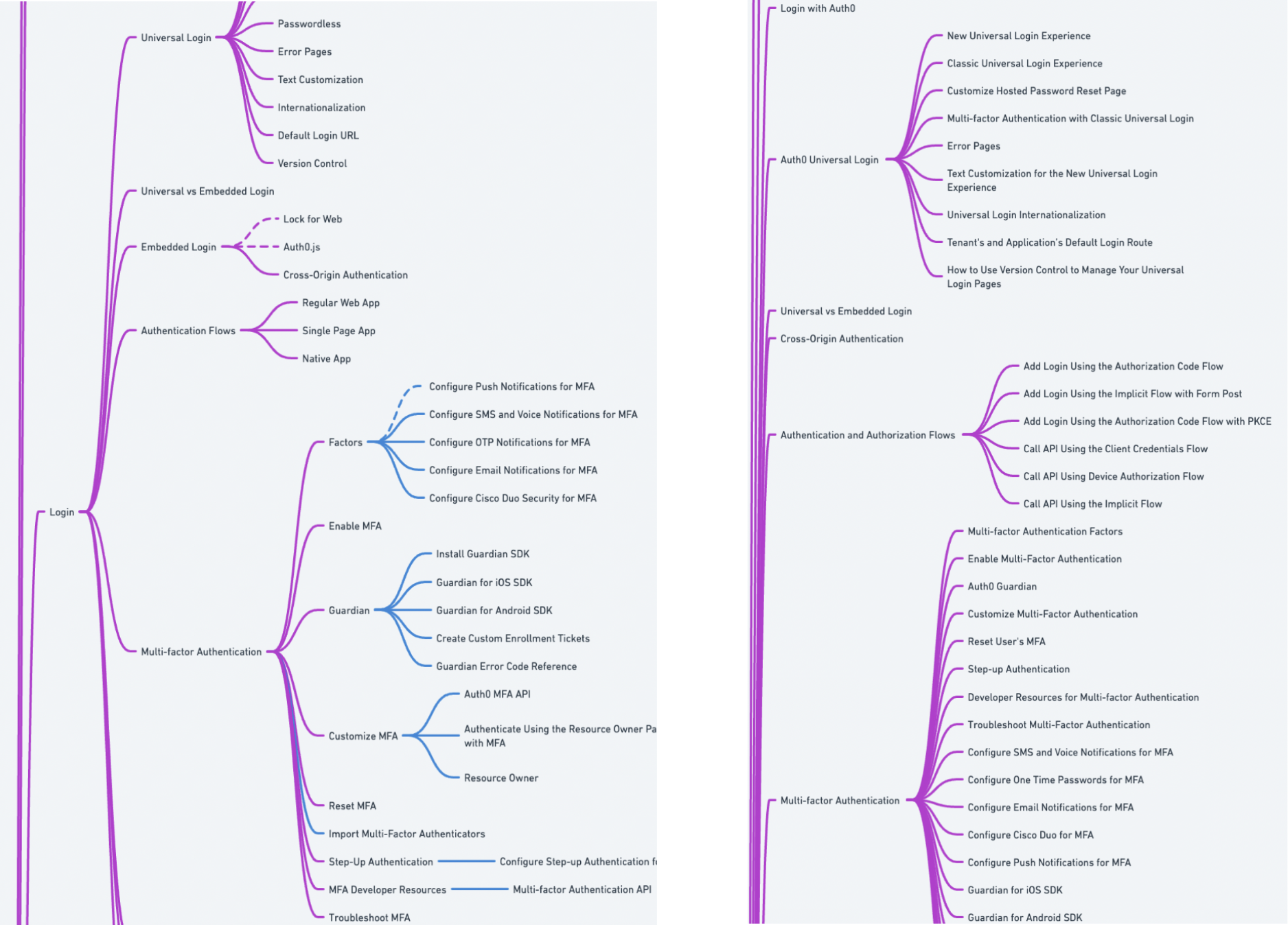
Roughly 25% of content was missing from the sidebar navigation, including some entire sections!
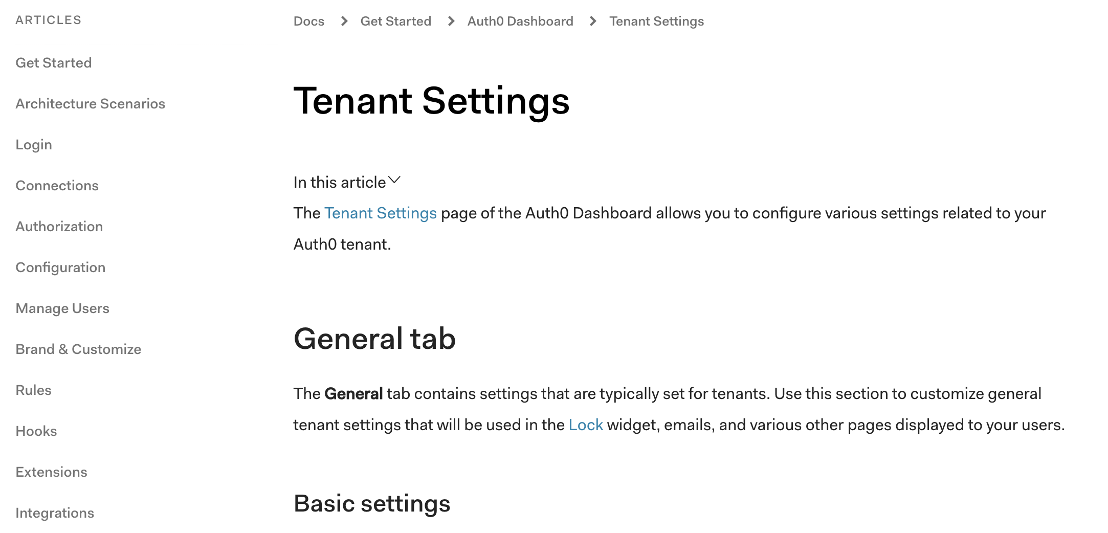
The hierarchy of sections didn’t always match between the sidebar and breadcrumbs.
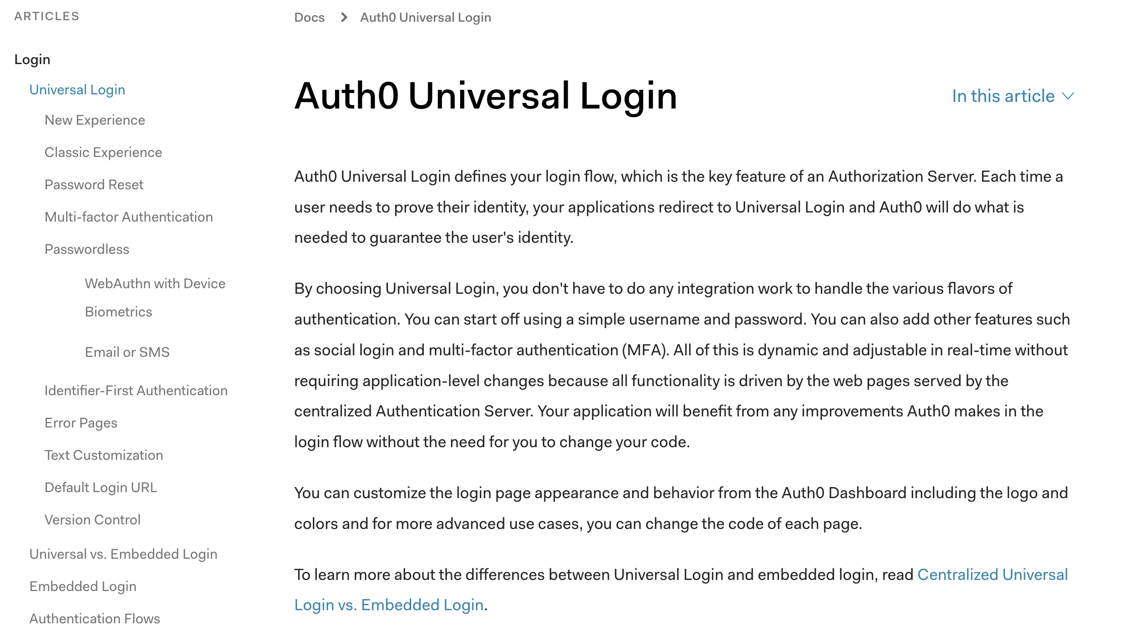
Some content was in different sections in the sidebar vs the breadcrumbs.
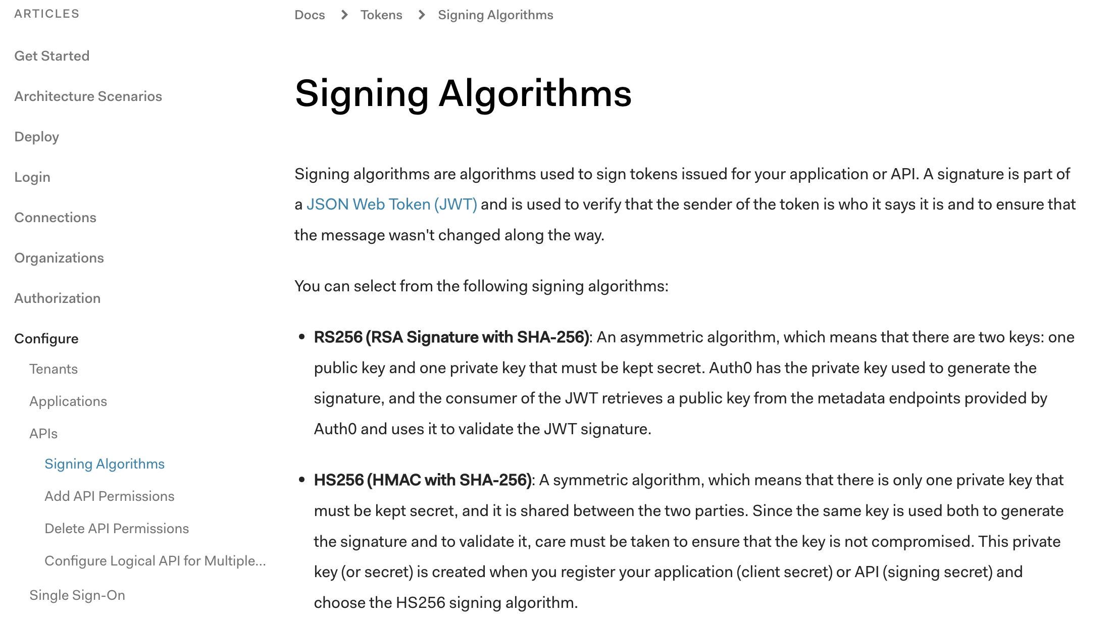
75% of docs content had some sort of mismatch between the sidebar and breadcrumb navigation
Card Sorting and Wayfinding
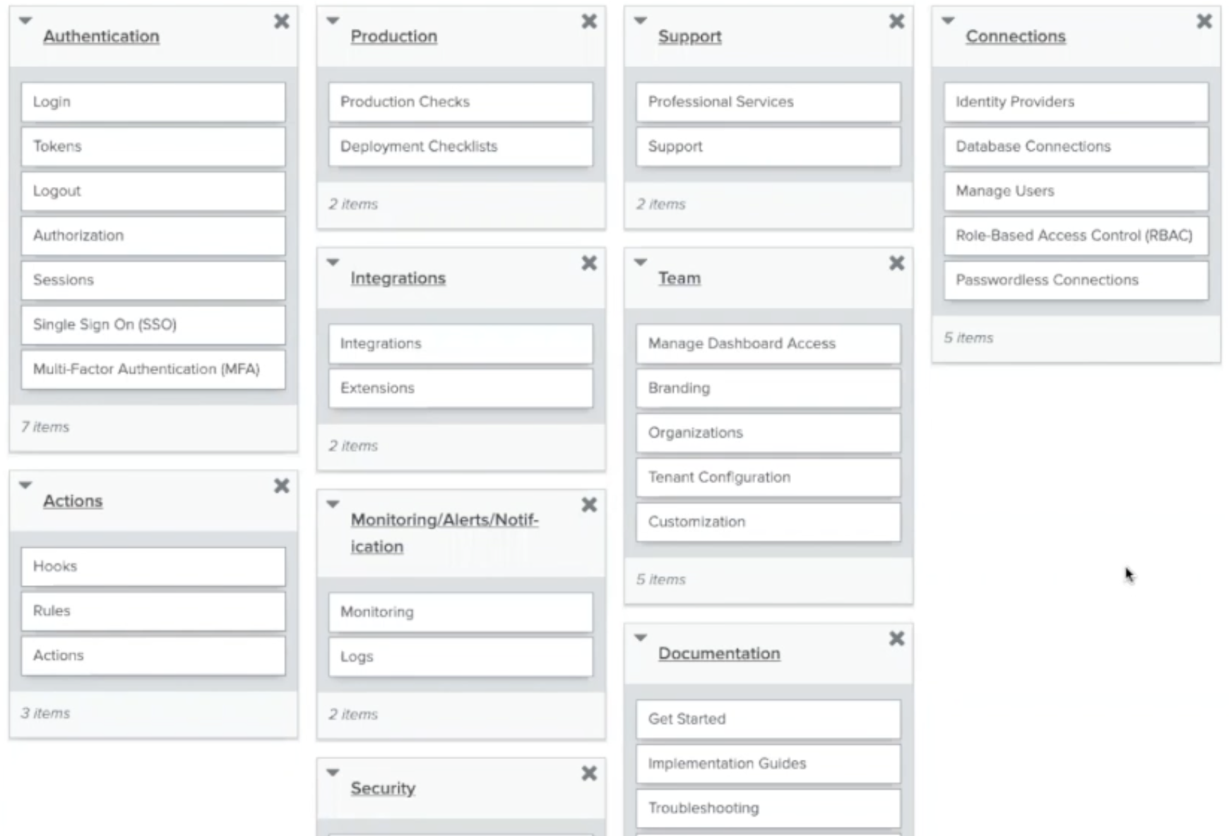
I conducted open and closed card sorts for topics in our existing navigation menu to get a better understanding of participant’s mental models.
Most people fell into one of two groups:
Some users grouped topics by task, creating groups based on a user’s journey through setting up and configuring Auth0.
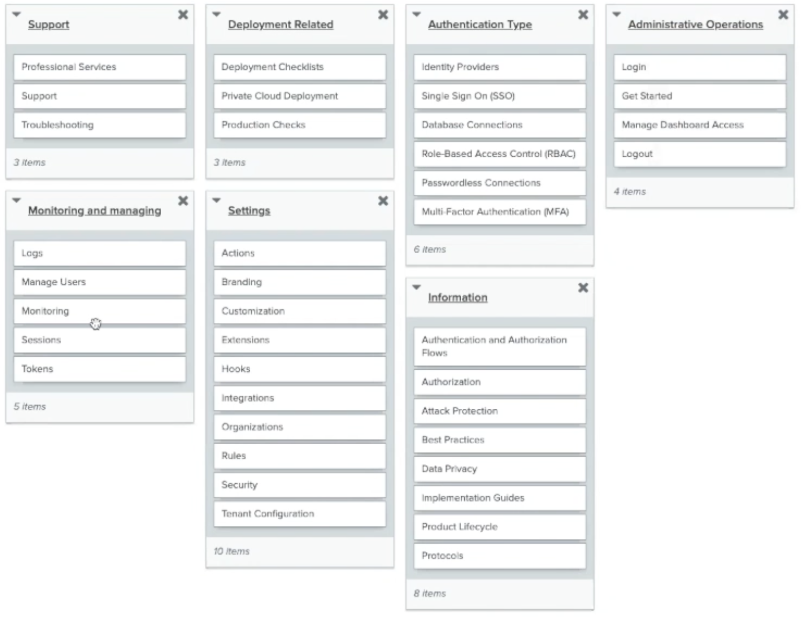
Others grouped topics more by feature, creating groups around authentication users, securing their applications, or configuring different integrations.
To validate the results of the card sorting, I followed up with wayfinding tests for both a task-based IA and a feature-based IA.
Once again, different people had different mental models about how the topics should be grouped. Overall, however, more people were successful with the feature-based navigation and reported preferring that option.
"I preferred the [Feature-based] experience because the top bar navigation was segmented more and the headlines were much less ambiguous."
Design and Implementation
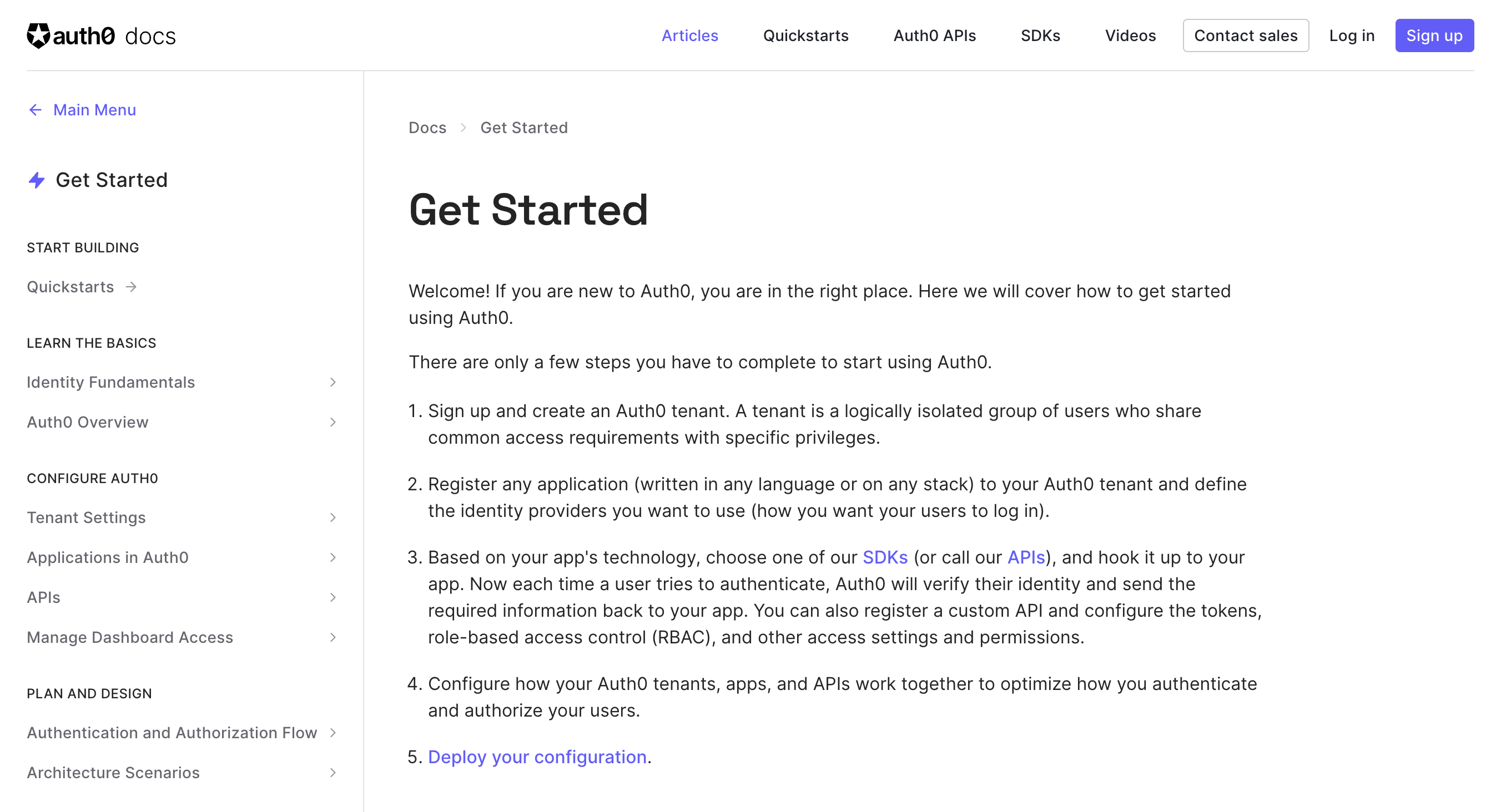
We made some small tweaks based on some of the feedback from our usability testing and then designed the new sidebar sections, which include Get started, Authentication, Manage Users, Customize, Secure, Deploy and Monitor, and Troubleshoot.
I paired with our frontend engineering team to iterate on the behavior of the new sidebar, how users would move from one section to another, and the mobile version of the navigation menu.
Validation and Next Steps
Because there are so many potential paths through our documentation, it is difficult to quantify the precise impact of the information architecture change. However, the qualitative feedback we collected through follow-up interviews and our embedded feedback widget were overwhelmingly positive.
The next phase of this project was to create new landing pages for each new navigation category, which you can read about in my Landing Pages Case Study.