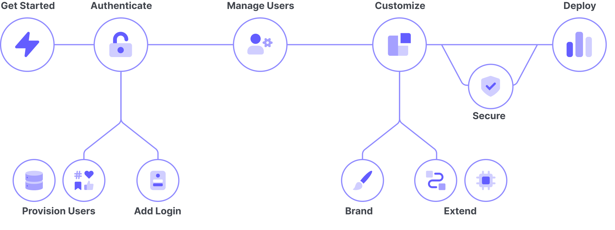
Auth0 Docs Landing Pages
Overview
The restructuring of the Auth0 docs information architecture was designed to make the Auth0 docs easier to navigate for developers who are new to identity and access management (IAM) concepts. As a next step, we wanted to create landing pages to provide a better introduction to identity concepts.
When we restructured the Auth0 docs information architecture, we split the content of the docs site into seven high level categories:
- Get Started
- Authenticate
- Manage Users
- Customize
- Secure
- Deploy and Monitor
- Troubleshooting
In order to iterate towards our goal of improving the docs experience for users new to identity and access management (IAM) concepts, we wanted to introduce developers to each of these sections, while also helping them get a better high level understanding of the Auth0 product.
Design and Content
Our technical writing staff developed new content for each landing page and the homepage and I put together three design proposals to test with users.
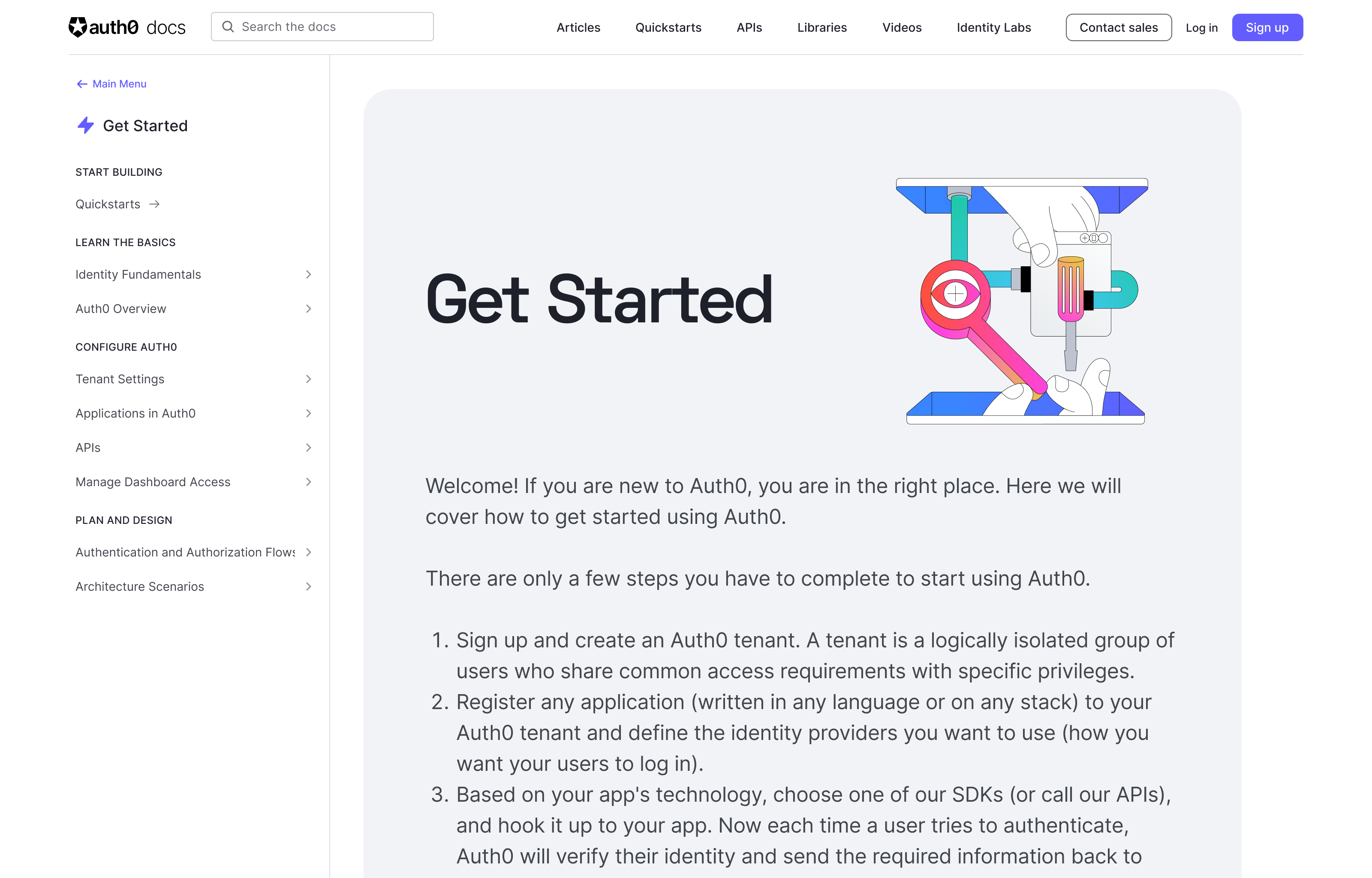
The first design paired the introductory text with illustrations created by our visual design team.
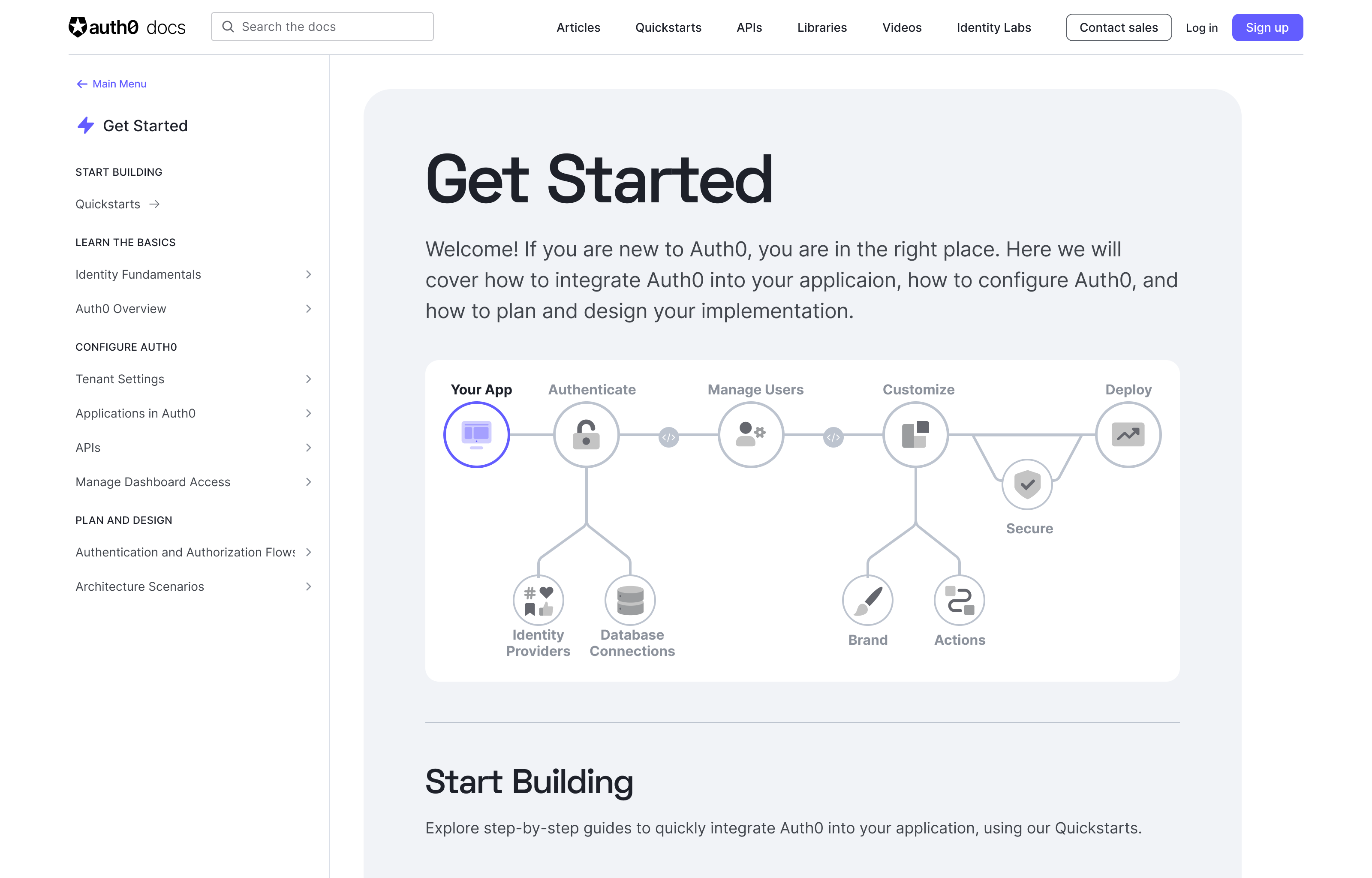
For the second design, I created a simplified diagram of Auth0’s architecture that mapped to our new sidebar navigation.
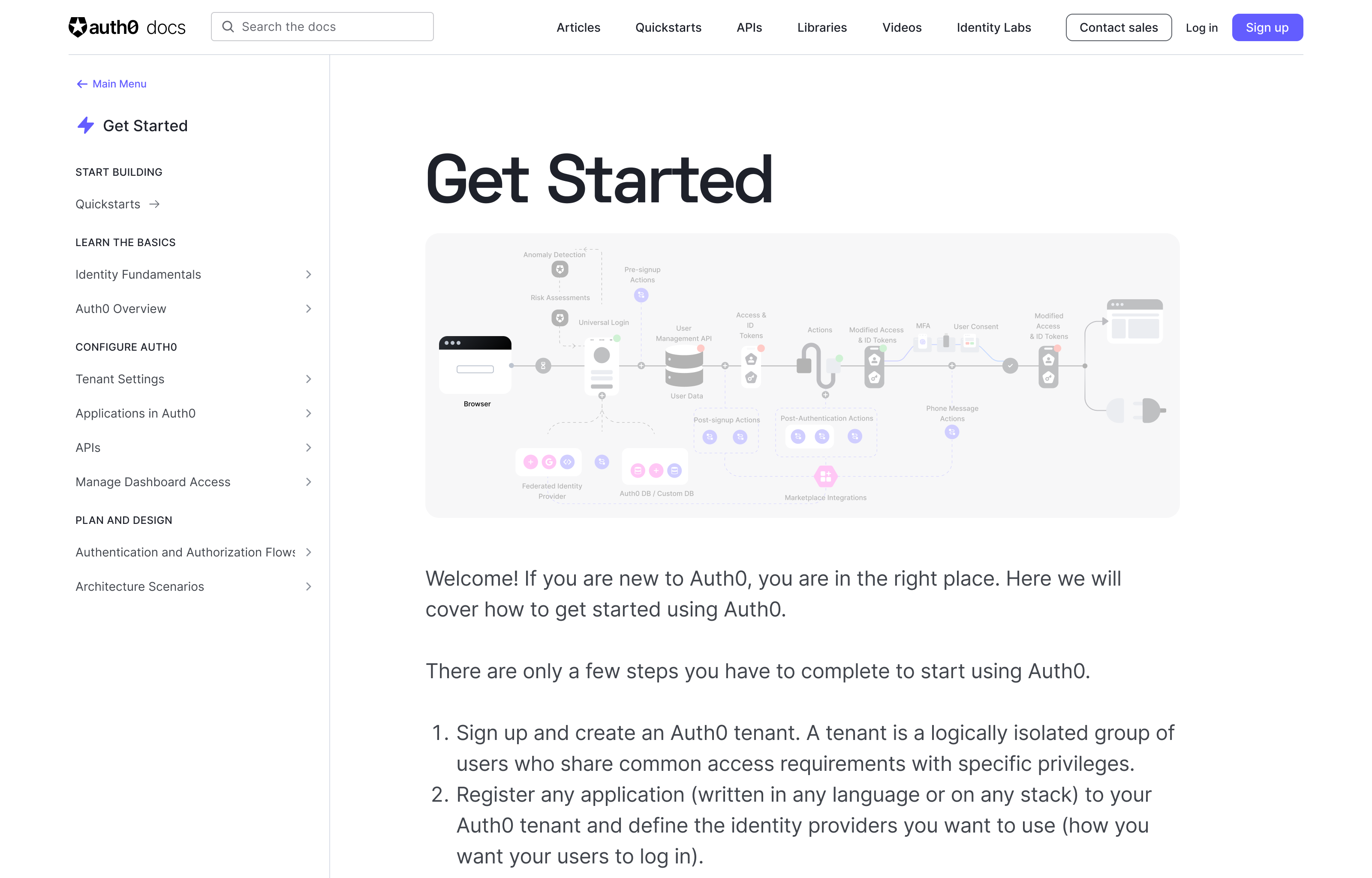
The third design used a much more detailed diagram of Auth0’s architecture.
Research
To test the designs, I interviewed developers various levels of experience both with Auth0 and with authentication in general.
All of the developers liked the content of the landing pages and believed it provided a good introduction to each section.
The version using the illustrations didn’t resonate with any of the developers. They felt the illustrations were too abstract and didn’t contribute to their understanding of the concepts.
The software architect liked the more complex architectural diagram, but thought it was too detailed for a landing page and would be better suited to a different part of the docs.
The remaining developers all strongly preferred the simplified diagram. They liked that it:
- Gave them a high level understanding of the product at a glance
- Mapped to the docs navigation
- Helped them to understand what was in each category
Implementation
Once the research was concluded, I made some iterations to the design based on feedback from our users, the docs team, and the product design team.
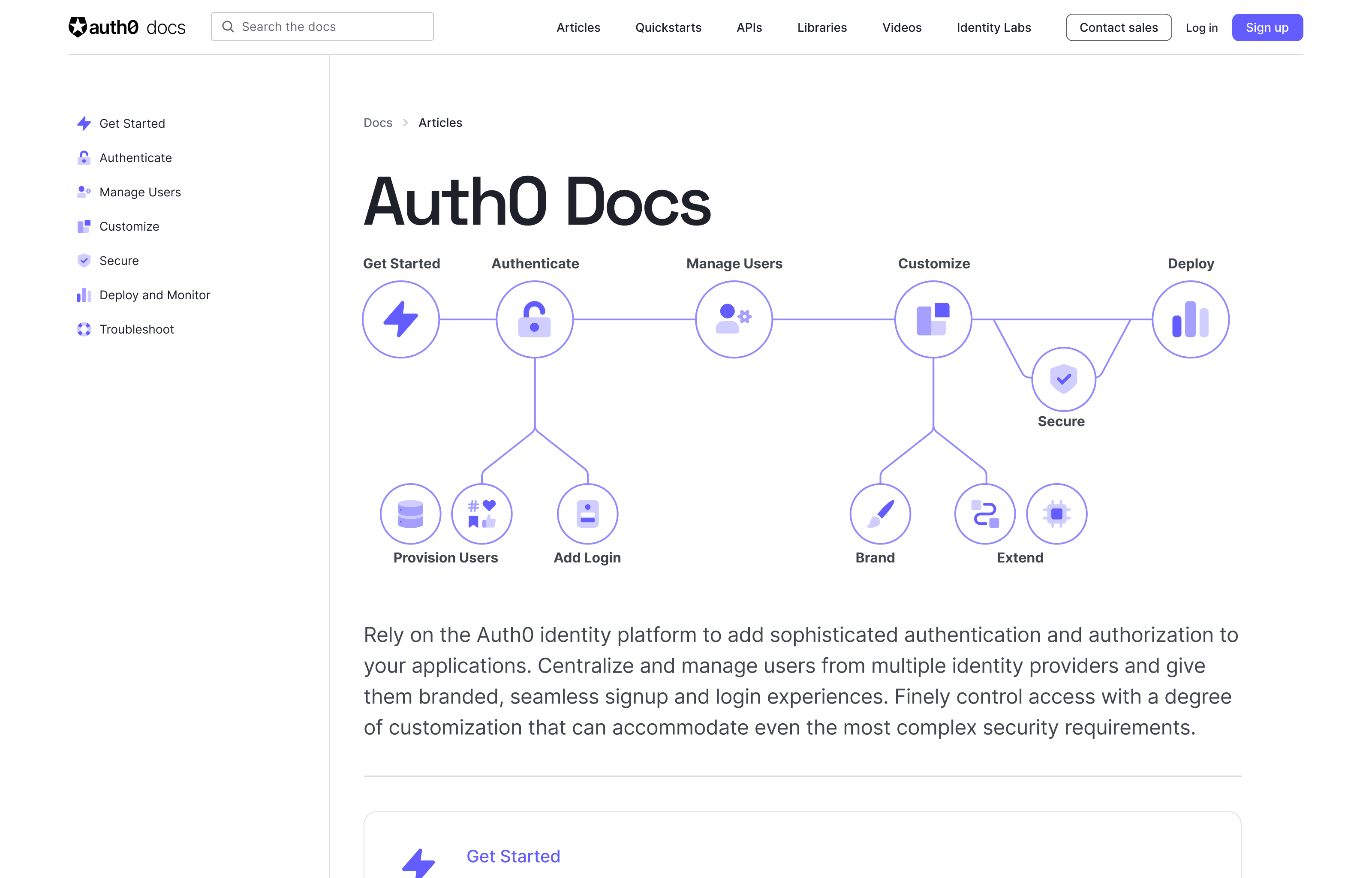
Then I paired with our frontend engineering team to work on the implementation of the diagram, including making it an interactive way to navigate between the different sections of the docs site.