Auth0 Interactive Quickstarts
Overview
Auth0’s quickstarts let developers quickly spin up a new application and add login and logout functionality, allowing them to learn the product by diving directly into the coding experience.
Updating Our Quickstart Experience
We’d always gotten positive feedback on our quickstart experience, as well as on our developer experience overall. However, our quickstarts hadn’t seen a substantial update in about 5 years, and we wanted to modernize the experience and look for opportunities to make it even better.
In order to get a better understanding of what developers liked about our quickstarts as well as areas for improvement, we kicked off this project by conducting a usability test on our existing quickstarts.
Identifying and Addressing Pain Points
After completing the usability testing, we identified the following problems we wanted to solve:
Problem
Incomplete Code Samples
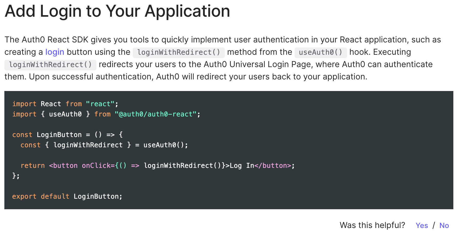
The code samples provided in the quickstart were incomplete snippets and failed to call out a specific file name for where to put the code. While more experienced React developers generally figured this step out without assistance, we noticed that it was something novice developers really struggled with.
Solution
Provide Pre-Configured Full File Code Samples
Rather than showing incomplete code snippets, we can provide full file code samples, including the file that the code would be placed in. This will reduce confusion for novice developers.
Problem
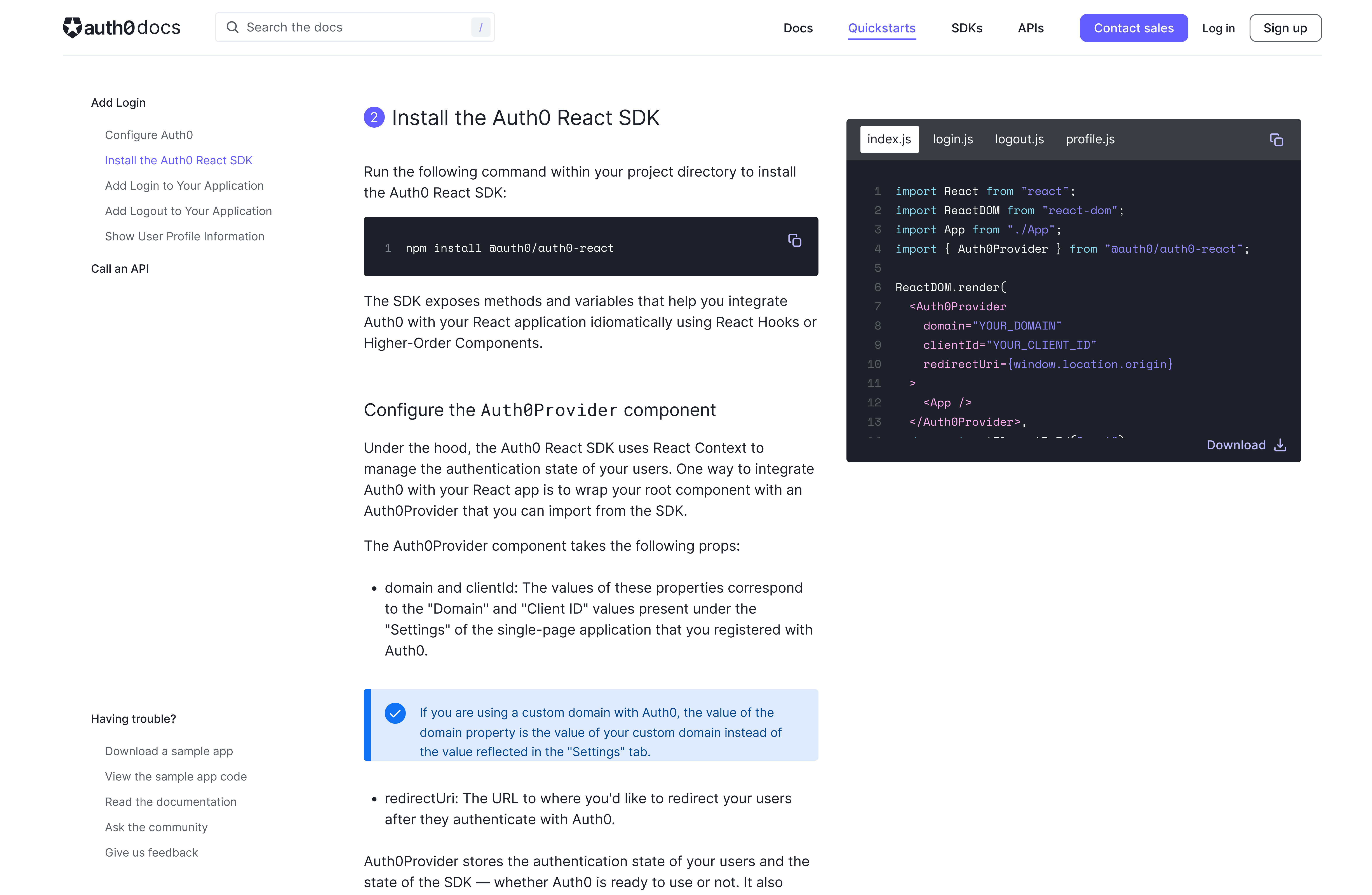
Too Much Context Switching
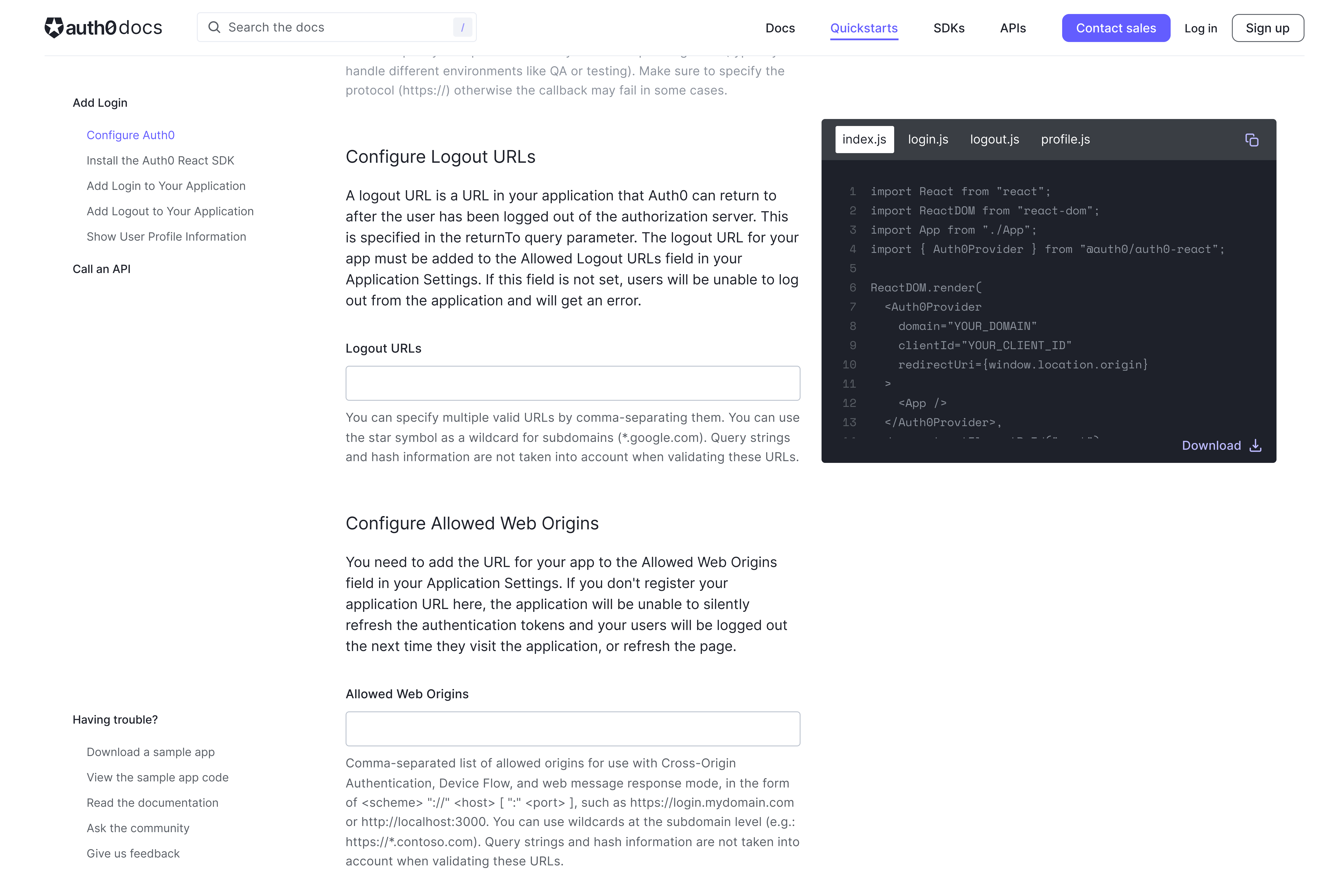
In order to follow along with the quickstart, users would have to navigate to the Auth0 dashboard to enter their callback, logout, and web origins URLs, then copy the code samples from the quickstart into their code editor. This context switching slowed down the integration process, and created a less focused experience. It was also prone to error, as users frequently forgot to save their URLs in the dashboard.
Solution
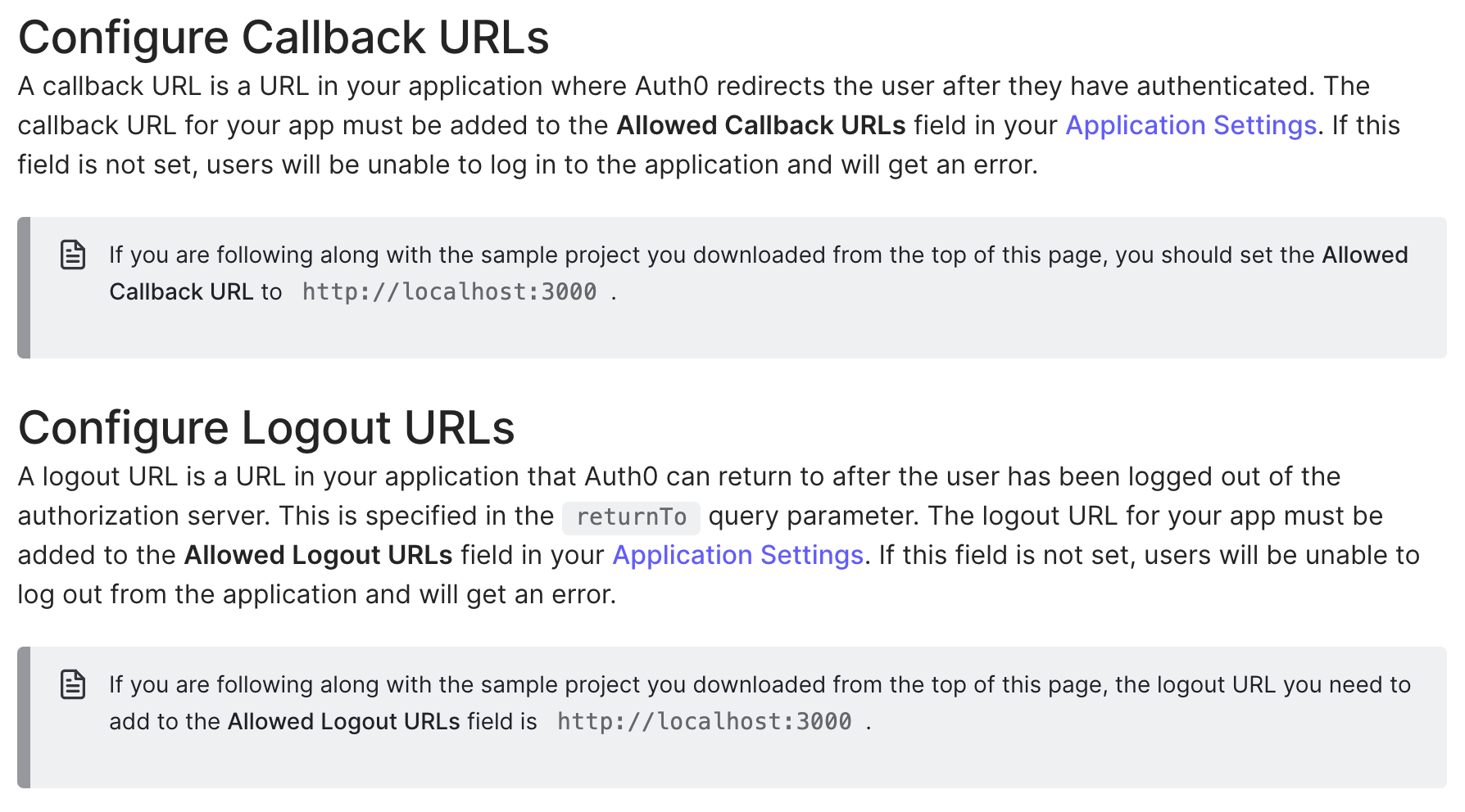
Configure URLs from the Quickstart
By allowing users to configure their callback, logout, and web origins URLs directly from the quickstart we can reduce context switching and speed up integration time.
Problem
Unclear Benefits of Account Creation
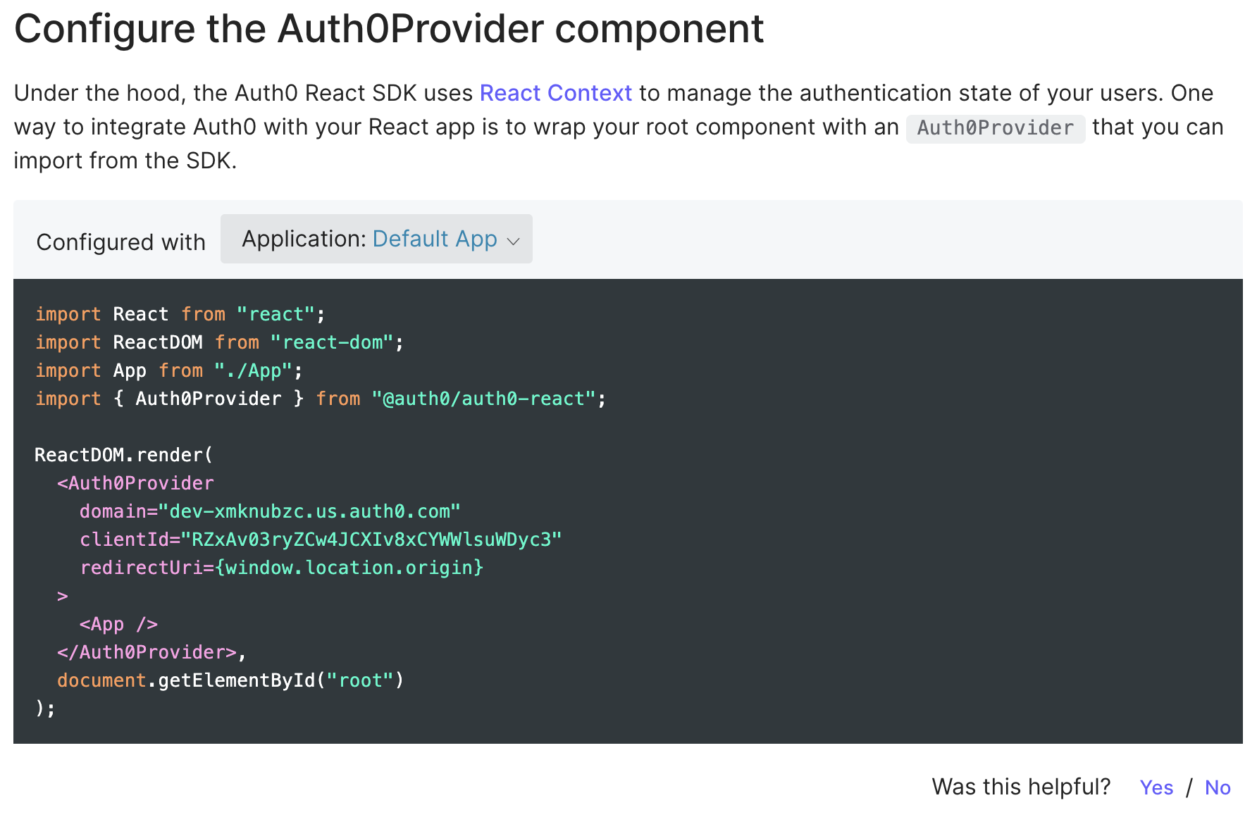
If users had a free Auth0 account and were logged in, the code samples in the quickstart automatically update to include information tied to their application.
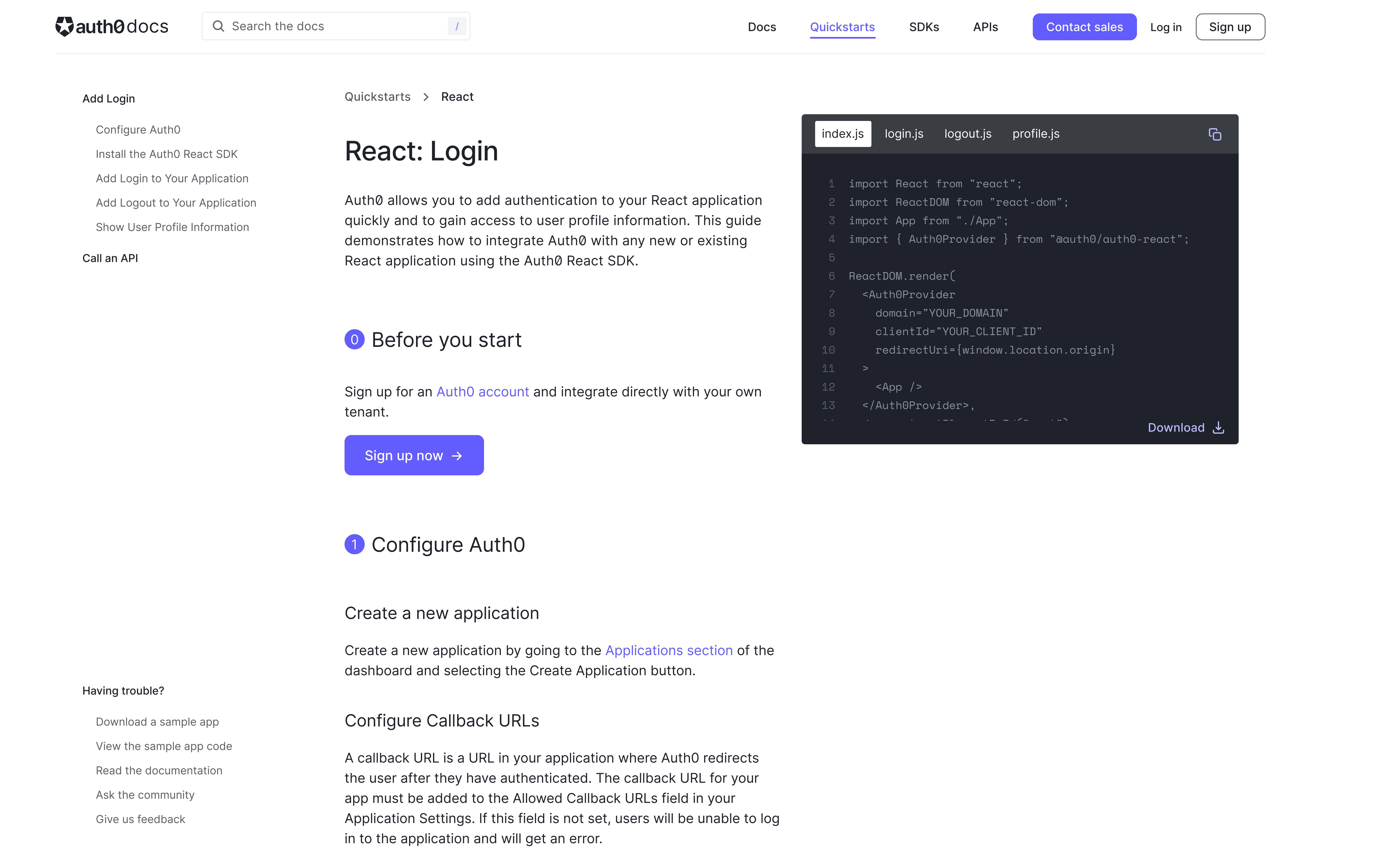
Our testing showed that, while the quickstarts recommend creating an account, the information is buried in the introduction and doesn’t do an adequate job of conveying the advantages of doing so.

Solution
Make “Create Account” or “Login” an Actual Step
We can do a better job of encouraging account creation and login by making this an actual step in the process as opposed to a suggestion.
Problem
Sample App Confusion
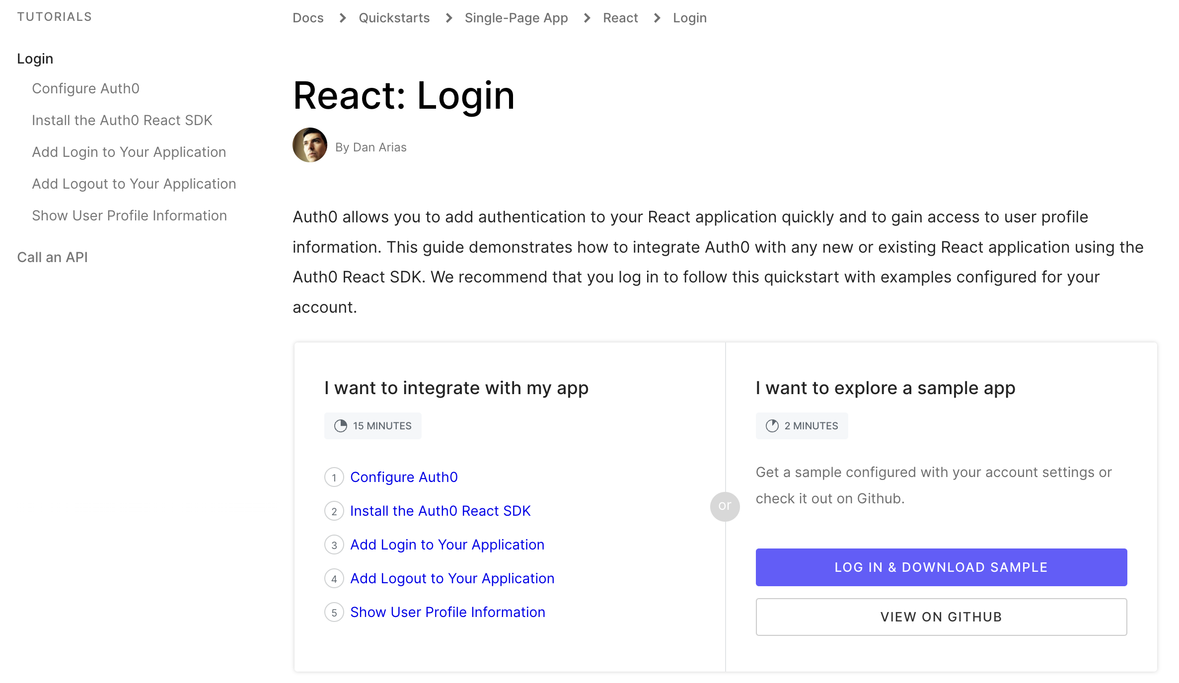
The existing quickstart offered a sample application as an alternative to the integration steps. Users were forced to choose which path to follow from the very beginning, with no clear guidance on the advantages of one approach over the other.
Solution
Use the Sample App as a Guide
Sample apps could be put to better use by serving as a guide for novice developers as opposed to a different path.

Design
I began working on designing a new, more interactive version of the quickstarts that addressed these goals.
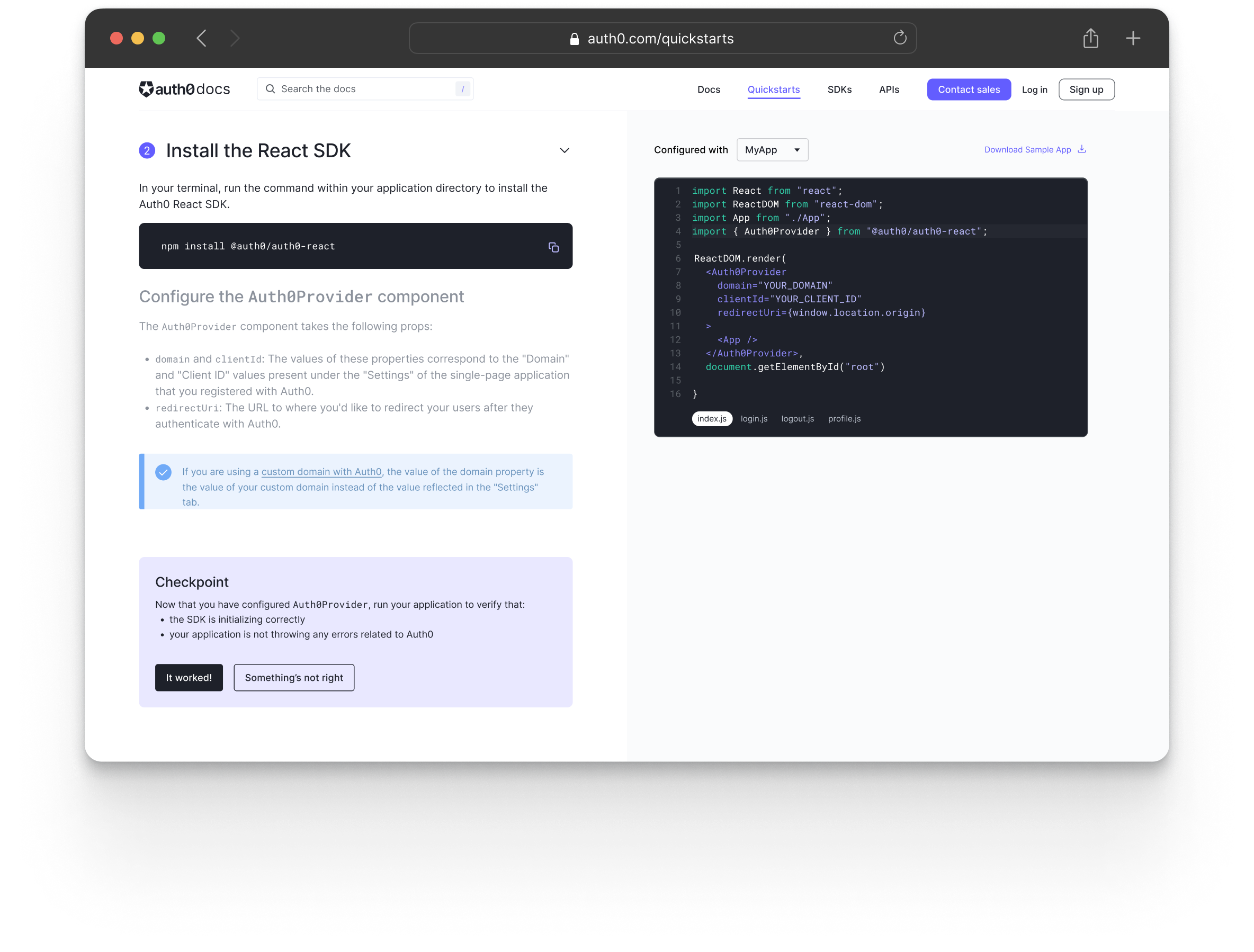
Users can check out the code samples, copy code snippets, or download all the files at once to edit in their code editor. The code samples also update so that the relevant file is displayed as the user scrolls through the guide so that the relevant sample is showing for each step.
Iterations
I shared these initial designs with the team and met with my product manager and the lead engineer on the project to discuss next steps. After discussing the technical feasibility, we opted to take the automation one step further by adding the ability to create or change an application directly from the quickstart, thus eliminating the need to switch from the quickstart to the dashboard at all.
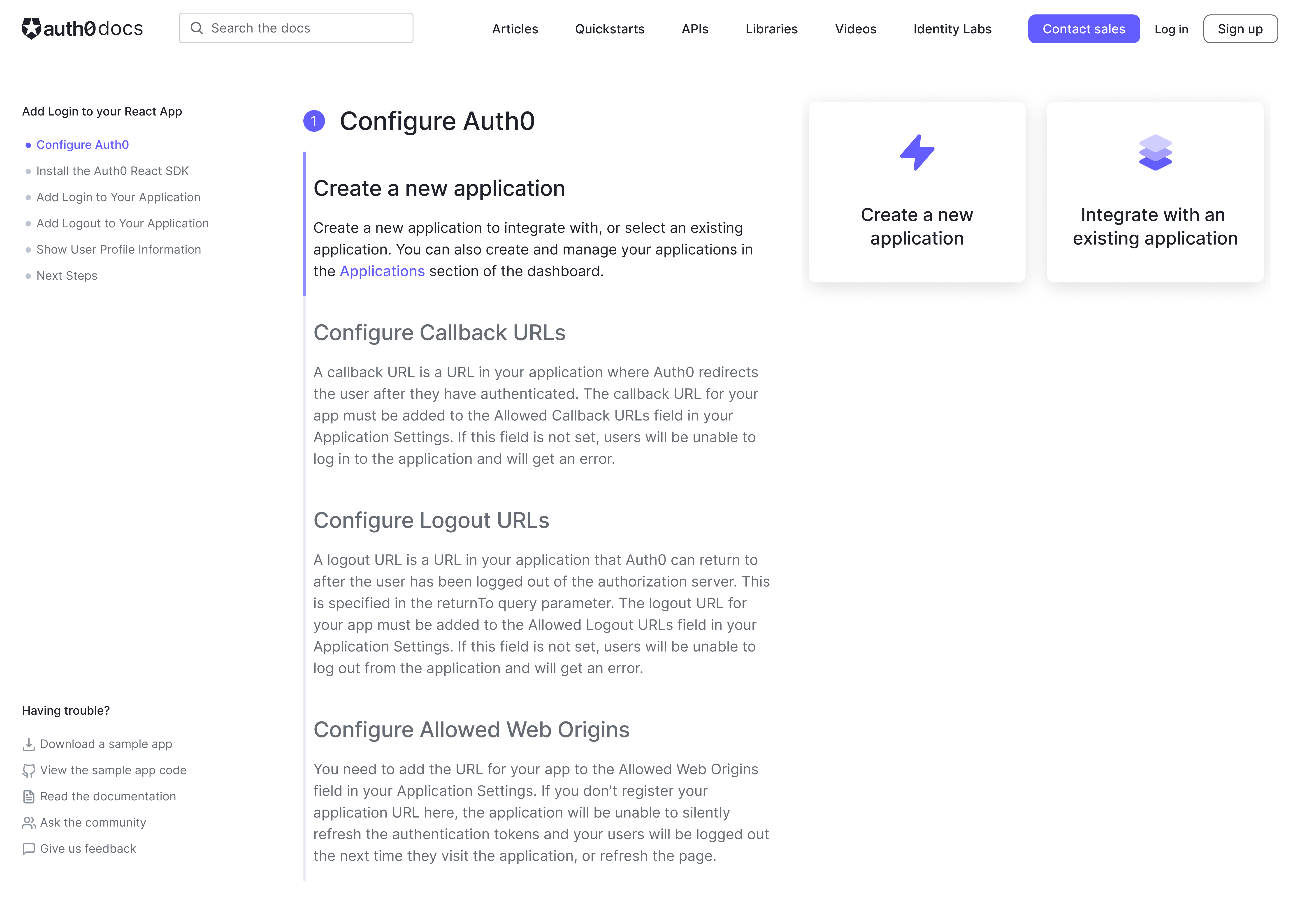
We also decided that since the code samples wouldn’t be relevant until later in the quickstart that we could put all of the application configuration steps on the right side of the new layout and have the content update automatically as the user scrolls through the guide.
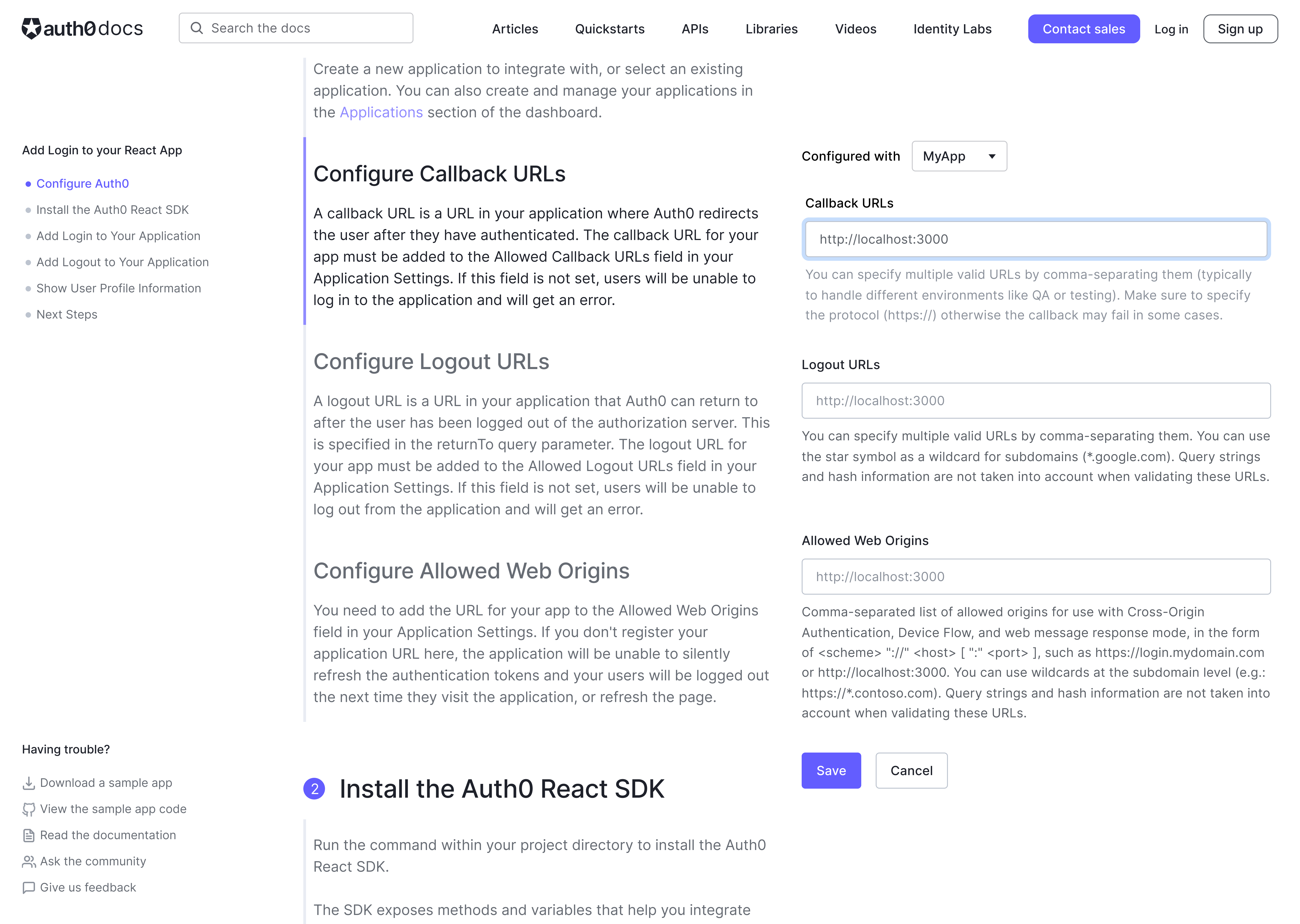
Usability Testing
Because this new design was such a significant departure from our previous designs, we wanted to run some usability tests to make sure it was still easy for users to get up and running quickly and to ensure that we weren’t taking the automation too far.
The reactions to the new version of the quickstart were overwhelmingly positive, with participants noting that it was intuitive and easy to use and that having the code samples update as they scrolled through the instructions made following along a “no-brainer.”
"It’s so clear and so precise that anyone could just follow it step-by-step....it’s broken down in a way that’s much more intuitive to the user."
Design Updates
Once we were confident that we were on the right track with the new interactive quickstart I presented it to the rest of the product design team at a design critique to get some additional feedback. I made some additional iterations on the design based on that feedback. I replaced the sidebar navigation with a dropdown at the top of the page in order to provide more room for the content and keep the layout simpler.
Handoff and Implementation
With the design mostly finalized, I worked with our engineering team on implementation. I had weekly syncs with the engineers and product manager to get status updates and work out the remaining details.
The new quickstart design launched as a beta test in late February 2022. We then conducted an additional round of unmoderated usability testing once the Quickstarts were live in order to validate the new design. While overall the feedback was quite positive, we did identify two small areas for improvement. The first was that users were still missing the instructions to sigh up or log in to their accounts, despite the large call to action. To address this, I proposed surfacing the interactive fields earlier, but keeping them disabled until a user logged in. The second issue was that some of the placeholder text was confusing, as users assumed the information was already populated. We addressed that by removing the placeholder content and using helper text instead.