A strong developer experience has always been a core part of Auth0’s DNA. Since our founding we have deliberately built a developer-first product and it continues to be a key part of our success to this day. Naturally, maintaining excellent developer documentation is an essential part of our strategy.
Because identity and access management (IAM) is such a complex topic, our documentation needs to not only teach developers how to implement Auth0, but also how to integrate it within a larger ecosystem as well as teaching developers the basic concepts and best practices of IAM.
We’ve gotten a lot of feedback over the years from the developer community that our docs are fantastic and they’re frequently cited as being a competitive differentiator.
I'm a noob at Auth0 so @raae is probably a better source of info. However, as an Auth0 noob it took me about 3mins to get basic sign up / login flows working.
— Paul Scanlon (@PaulieScanlon) August 6, 2021
The docs are really good too + James Quick (Dev Rel) is an absolute gent!
OK, I'm calling it... the @auth0 documentation and blogs are some of the best technical writing I've ever used.
— Paul D'Ambra (@pauldambra) April 25, 2019
oAuth is mad complicated and their docs are always helpful and clear.
kudos to everyone that work(s|ed) on them
Unfortunately, we also get a lot of feedback that our docs are terrible and difficult to navigate.
honestly I have never tried to use a piece of technology that made me feel more stupid than auth0 (at least recently).
— Monica Lent (@monicalent) December 15, 2021
such confusing docs spread everywhere, it was so bad I was explicitly looking for unofficial docs in google. the ease of MVP setup is super misleading…
In order to figure out why some people loved our docs while other people hated them, I began conducting discovery interviews with our customers. Some of the themes that emerged from this discovery were:
The developers who loved our docs tended to have more existing knowledge about IAM concepts before coming to Auth0. Users who had less experience in the IAM space generally struggled to make sense of our docs. Users with less IAM experience relied more on the structured navigation of our documentation and found it difficult to find what they were looking for, while users with more IAM experience relied more on Google searches that led them either to the correct docs, or to blog posts and community forums. Because of all the new concepts being introduced and the number of cross-links within our documentation, users ended up jumping back and forth between multiple tabs. Based on these learnings, we decided to focus much of our attention on improving the information architecture of our docs site to better serve users who are new to IAM concepts.
Information Architecture: What is it and Why Does it Matter?
If you’re not familiar with Information Architecture (IA), it refers to the way we arrange content to make it more understandable as well as the practice of deciding how to arrange information. Navigation is obviously a big part of this, and most of our efforts revolved around improving the sidebar navigation of the docs site.
IA vs SEO: Why Not Both?
When I initially proposed overhauling our information architecture, I got some pushback from stakeholders arguing that good navigation isn’t that important because “everybody just searches for what they need.” And while it’s true that over 70% of our traffic came from external searches, I didn’t think that number told the whole story.
First, search data alone doesn’t tell us whether users were searching because that’s how they’re accustomed to navigating, or because our navigation falls short. Studies have shown that roughly 65% of all searches are preceded by navigation attempts*, so it’s likely a bit of both. (*Based on NN/g analysis of 90 usability task recordings, observing hovers/fixations on menus preceding searches).
Second, search is most useful when users have a good idea of where to start and have a general idea of how to describe what they’re looking for. It’s less helpful when users don’t know what they don’t know. Users who are less familiar with identity concepts (aka our target audience) may not know the correct terminology and often rely on navigation and related links to guide their early learning.
Good navigation also helps users form a mental model of where they are and how everything interconnects. Imagine you were suddenly dropped in the middle of a strange city without a map and told to go from point A to point B. If the city is like Manhattan, with a well-planned grid system, you should be able to quickly get a sense of where you are and where you’re going. If the city is like Boston, with winding streets based on old cow paths, you’re going to have a harder time. SEO might be able to drop you in the right spot, but when it comes to figuring out where to go from there, we wanted our docs to be less like Boston and more like Manhattan.
For more on the need for both search and navigation, check out NNG’s excellent article, Search Is Not Enough.
Identifying the Problems
I knew from casually browsing the docs site that there were some definite problems with the information architecture. There were pages that could only be accessed via cross references from other pages, and docs that lived in multiple places on the sidebar navigation, for example. In order to get a deeper understanding of the problems I conducted a content audit of our 1,000+ pages of documentation. As you can imagine it was quite an undertaking.
A Tale of Two IAs
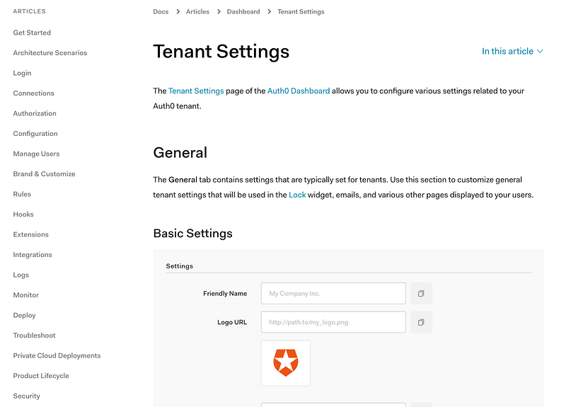
One of the first problems we had to deal with was that we didn’t just have an unclear information architecture…we actually had two unclear architectures. Prior to summer 2020, all of our docs and the sidebar were maintained on Github. Then we migrated most of our docs to the Contentful CMS. After the migration, our sidebar was being manually generated in a yaml file hosted in Github, while the breadcrumbs were dynamically generated based on the file structure of the docs in Contentful.
Over time, these two architectures diverged, reaching a point where over 50% of our content was orphaned and didn’t show up in the sidebar at all. Some orphans were individual pages that could only be reached by following a series of in-page links and in some cases entire sections were missing from the sidebar.
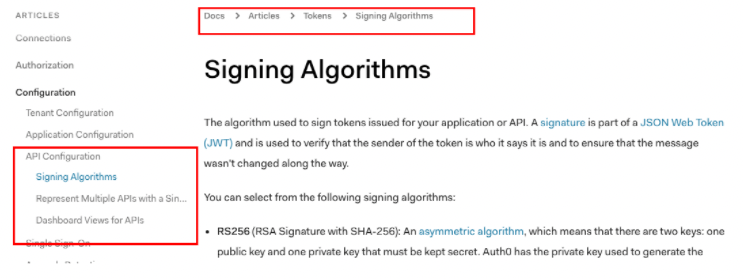
Additionally, 25% of our content experienced a mismatch between the breadcrumbs and the sidebar, due to different parent categories and other inconsistencies.
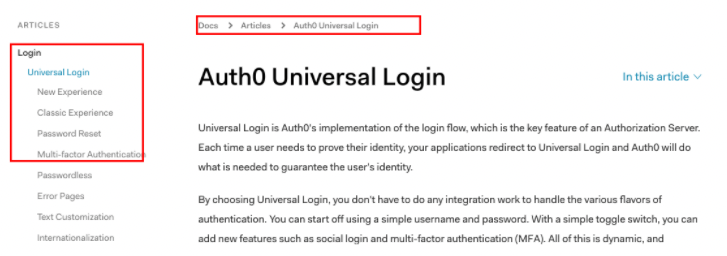
The two separate IAs also had inconsistent hierarchies, with some categories being a top level category in the breadcrumbs while being a second or third level category in the sidebar.
All told, I realized that if you landed on any given doc from a search, there was about a 75% chance you wouldn’t be able to orient yourself based on the sidebar and breadcrumb navigation. This made for an undeniably bad user experience. Being able to frame the problem this way was, however, very useful when it came to getting stakeholder buy-in.
Our first order of business was to address the underlying technical issues that led to these mismatches and have a single source of truth for both the breadcrumbs and the sidebar navigation. A team of technical writers worked on cleaning up file structure in Contentful and our engineering team reworked the sidebar so that both the sidebar navigation and the breadcrumbs would be automatically generated from the file structure in Contentful.
Once the technical side of things was cleaned up, I wanted to focus on how to make our IA easier to navigate for new users less familiar with identity.
Our sidebar was quite long, with over 20 top level categories, and the category names could be confusing or meaningless for users who weren’t familiar with Auth0 or identity concepts. The categories were roughly in the order in which a user might want to learn about the product, but that wasn’t really clear from the way they were displayed.
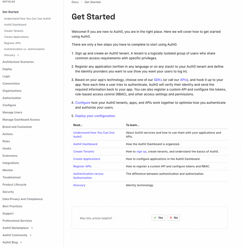
Based on my previous research, as well as looking at other popular docs sites, I believed that our users would be better served if we broke up the sidebar into different sections based on the jobs to be done.
Usability Testing
In order to validate this idea, I created two prototypes focused on documentation about user management.
The first presented our navigation as it currently existed as a control.
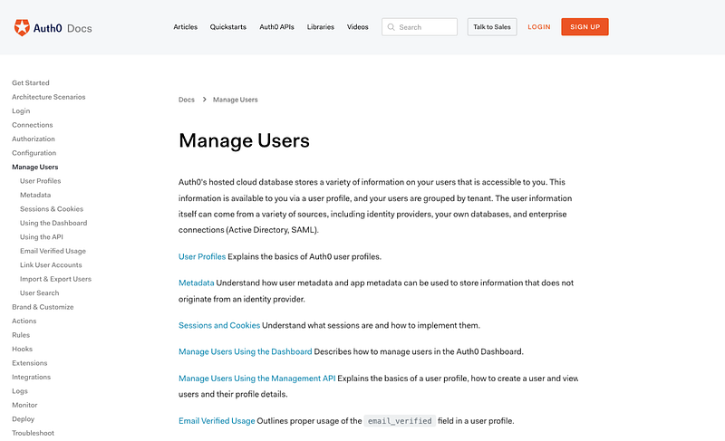 The second prototype grouped related sections (user management, provisioning users, migrating users, access control, etc) together into a single section focused on the “job” of managing users.
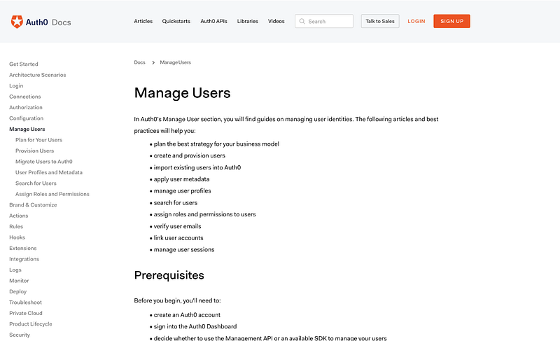 I performed an unmoderated usability test with fourteen participants who were at least somewhat familiar with identity concepts but had not used Auth0 before. They were asked to find the same information with both prototypes. To reduce bias, half saw the control version first and half saw the new version first.
The results showed that users preferred the “jobs to be done” based approach where similar topics were grouped together, and they also had higher success rates with this version.
Based on these findings, I decided to move forward with the approach of grouping the existing top-level topics into related groups.
Card Sorting
In order to determine how to best group the topics in the sidebar navigation, I performed a series of card sorts. I created cards for each of the top-level items in our existing navigation and had participants perform open card sorts (where they grouped items however they wanted) and closed card sorts (where they grouped items into predetermined categories). Half of our participants were developers familiar with identity concepts who have not used Auth0, and the other half were Auth0 customers.
The results of the card sorts tended to take one of two approaches.
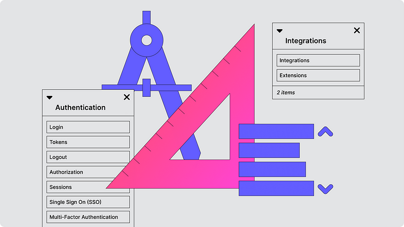
Some users were very task oriented and would group topics in categories such as “Settings” for anything that gets configured in the dashboard and “Information” for concepts they needed to learn about. They generally divided topics between conceptual information and actionable steps.

Others grouped topics more around features, for example creating groups like authentication and integrations.
Wayfinding
I knew the next step after card sorting would be doing a wayfinding test to validate the new sidebar structure. But since the card sorts seemed to indicate two different mental models, I decided to test both approaches.
People have different mental models. There isn’t a single solution that works best for everyone.
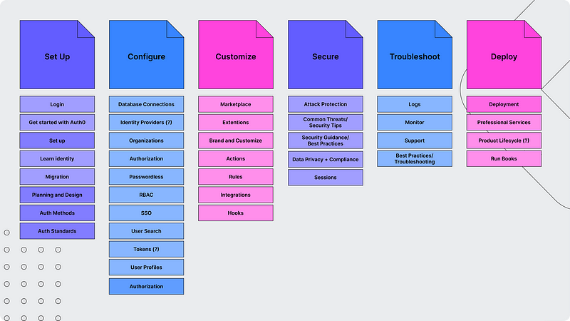
For the task-based approach I grouped the docs into the following categories: Set up, Configure, Customize, Secure, Troubleshoot, and Deploy.
 or the more feature-based approach I grouped the docs into these categories: Get Started, Authenticate, Manage Users, Customize, Secure, and Get Support.
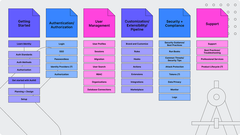 Testers were given 5 different topics and asked to navigate to those topics using both versions of the sidebar navigation. We tested with Auth0 customers, developers who have never used Auth0, and Auth0 employees.
The biggest takeaway from both the card sorting and the wayfinding was that people have different mental models and there really isn’t a single solution that works best for everyone. Some users believed the task-based approach made more sense and others resonated more with the feature-based approach.
While the test results were close, I did see a slight preference for the feature-based approach. People found the headings in the task-based approach to be a little too vague, and overall the feature-based version had a slightly higher success rate. The feature-based approach also more closely mirrors how we’ve structured the sidebar navigation in the dashboard, the global navigation on the marketing site, and how our customer success and training teams typically present information. In the spirit of iterative improvement, we decided to move forward with the more feature oriented option, while keeping in mind how we might continue to iterate to improve the experience for those who prefer a more task-based approach.
Design and Validation
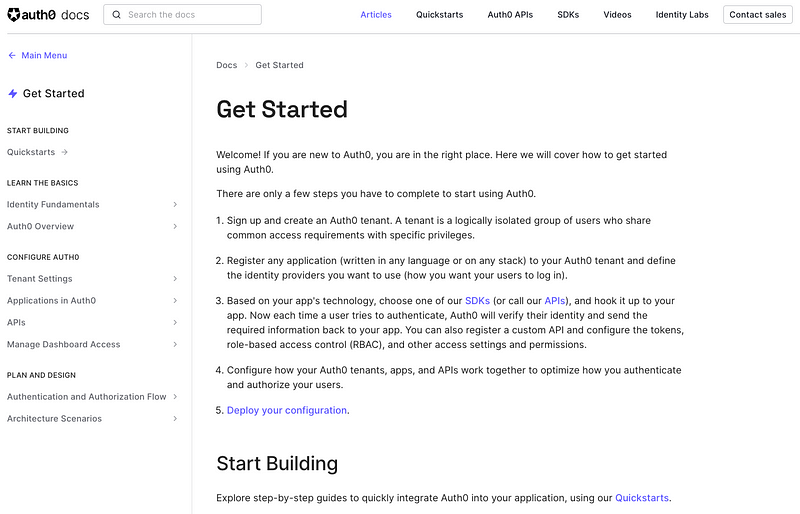
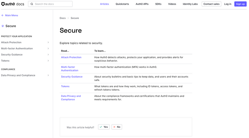
We made some small tweaks based on some of the feedback from our usability testing and then designed the new sidebar sections, which include Get started, Authentication, Manage Users, Customize, Secure, Deploy and Monitor, and Troubleshoot.
Next Steps
This is just the beginning. Because we’re taking our existing categories and grouping them into new larger categories, we’re able to make a big improvement with minimal rewriting and restructuring to our docs. However, we want to continue to iterate and improve this experience over time.
Since I learned from our card sorting and wayfinding tests that some users prefer to have information presented in a more task-oriented way that separates conceptual information from actionable steps, I’ll be looking into how we might accommodate those needs within the new information architecture I created.
While doing internal validation, I got some feedback that many of our features, like organizations or extensibility, could spread across multiple categories and that more advanced users might struggle to find all the information they need on those topics. I’ll continue to work to address these concerns and ensure our docs accommodating both new and advanced users.
In addition to the improvements to the sidebar that are launching this week, we’re also working on many other improvements to improve the experience for both new and experienced users. Our technical writers will be working on creating new content specifically for this audience, we’ll be adding more progressive disclosure to the different sections, and we’ll be improving the way pages are structured and information is presented. It’s an exciting time to be working on the Auth0 docs!
Originally published on Medium